Conversion Rate Optimization (CRO): How to Optimize Website Conversions with SEO
 Timothy Carter
Out of all the online marketing techniques you can choose from, focusing on increasing your conversion rate optimization (CRO) is one of the most important. Conversion rate optimization helps answer the following critical questions:
- How does your traffic behave when it actually gets to your site and views your web pages?
- What steps do your visitors take moving through your conversion funnel?
- Do your visitors bounce from your product pages or pricing page?
- Are any of your web pages a great example of high converting content?
- Is there any single page that supports your conversion funnel more than others?
- How is your traffic translating into meaningful revenue for your business?
- If your conversion rate is low, why?
- What can be improved on my landing pages?
When you fail to answer and improve upon these questions, you can generate all the traffic you like—and it won't matter to your bottom line. High traffic sites need more than visitors to your web pages to generate conversions. What you need is another step of the process: a way to convert your inbound traffic into paying customers (or at least get them further down the marketing funnel). Getting traffic to your landing pages is just the first step in this process. Earning more "conversions" is vital for your brand to stay afloat, but conversions come in dozens of different varieties, and the process is somewhat complicated. When it comes to conversions, you can measure your success by improving your conversion rate. This is the percentage of visitors who visit your web pages and take a desired action like downloading a file, using a free tool, signing up for your email list, or making a purchase. However, conversion rate optimization strategies are nuanced based on what conversion you're after. I'm here to walk you through everything you need to know about conversion optimization (CRO), from what qualifies as a conversion to ongoing best practices for success.
Conversion Rate Optimization Overview
First, in order to understand conversion rate optimization (CRO), we need to talk about what conversions are, why they're important, and some general points to keep in mind when optimizing your site for conversions. This is going to serve as the basic framework on which we'll build your direction and key strategies in the future.
Why Conversions Are Critical
You've probably "converted" or been a conversion before—and recently, too. Have you bought anything online recently? Your purchase technically qualifies as a conversion. Have you downloaded any free content in exchange for some personal information on any landing pages? This is a conversion too. Conversions aren't just about getting people to pay you money; they're about getting your users to make a meaningful interaction with your brand. SEO.co uses CRO tactics, just like you should, even on our home page:

Optimizing your conversions is important because without any conversions, your traffic will pass through your site like water leaking out of a bucket. Once it's gone, it can't bring any value to your brand. CRO itself is important because most of the time, conversions don't happen on their own. Website traffic doesn't convert automatically. Let's say you have the "perfect" product; it's cheap, it's something everyone needs, and it's something that generates mass appeal. You get plenty of traffic, your click through rate for your landing pages is high, but you never worked on your conversion strategy. You'll run into a number of potential problems:
- Your users might not understand how to buy your product.
- Your users might not realize your product is for sale.
- Your users may lose interest or procrastinate buying your product.
The list goes on. On some level, conversion rate optimization is about making people want to buy your product (or engage with your brand), but even more importantly, it's about giving them the power and opportunity to actually do it. When you achieve all of these goals, you'll see your site's conversion rate increase.
Understanding Your Conversion Goals
Before you get started in a CRO campaign, you need to understand what your core goals are. Yes, you'll obviously want to "increase conversions," but there are some other important elements to bear in mind here. You'll want to start by looking at your existing traffic before generating more website traffic. If your existing traffic doesn't convert, getting more traffic will only dilute your conversions. The first step required to optimize conversion rates is making sure you're generating targeted web traffic. You could have the best product with amazing customer testimonials and the most convincing call to action and you still won't get conversions unless your traffic is targeted.
Try our free tools to see where your website stands
Before you start optimizing your website for conversions, try one of our free tools to identify the easiest areas to address first. You'll find a good selection of CRO tools to help you get started.
Raw conversion power
The first and most obvious goal is increasing your total number of conversions. The greater percentage of visitors who convert, the more valuable your traffic is going to become and the more revenue you'll be able to generate for your brand. In a perfect world, your conversion rate would be 100%, meaning, you'd convert 100% of all website visitors who view a landing page. However, that's unrealistic. Even when traffic is highly targeted, it's rare to see a conversion rate above 25%. Ideally, you should aim for a conversion rate between 10-20%, with 20% being on the high end. If you can achieve 10% you'll be doing great. This is about the average conversion rate in most industries. You can improve this rate in a number of ways; for example, you can create more conversion opportunities throughout your site, create a smoother checkout page, a simpler web form, a clear pricing page, detailed product pages, make your conversion process easier to complete, or add a greater degree of urgency—I'll be digging into these strategies individually in later sections of this guide.
Increase your conversions first, then work on traffic
If your conversion rate is low, focus on improving your landing page conversions first before generating more traffic. A low conversion rate will remain low if all you do is bring in more visitors. In fact, bringing in more traffic can dilute your conversion rate even more. You can increase your website's conversion rate by working on page optimization. Conversion rate optimization will help you identify the reasons your landing pages aren't converting as high as it could be and will bring solutions to the table. Once you start implementing the solutions on your landing pages, you'll see your conversion rate grow. Then you can continue your optimization efforts while you generate more traffic. This principle applies to every website, including ecommerce sites. Ecommerce conversions work the same way as any other conversions. Whether it's a blog post or a product page, you'll boost conversions more by generating targeted traffic first.
Balancing conversions and traffic
Increasing conversions alone is good, but remember what I said in the introduction—it's only half the story. Optimizing conversions is about increasing the average value of a visitor to your site, but what if you're only getting a handful of website visitors to your landing pages? One focus is to rank in the search engine results page for your target keywords. You'll also need to consider ways to increase the volume and relevance of traffic headed to your site, keeping it in balance with your conversion rate optimization efforts. For most businesses, this balance is difficult to strike at first, and they end up pouring too much effort into one over the other. For example, some businesses focus too heavily on posting blog articles, although you do need a good balance there. Think carefully about your goals, who your potential customers are, and where you stand currently, then direct your efforts accordingly.
Variations in conversion value
You also need to understand that not all conversions carry the same value. It's easiest to imagine this in terms of a product purchase; a user buying an item for a few dollars counts as one "conversion," just as a user buying an item for thousands of dollars, yet clearly the latter is more valuable. Similarly, a strong lead filling out a contact form is more valuable than a new email subscriber signing up to receive new content from your brand. If you want to maximize your effectiveness, you'll need to keep these relative values in mind.
Relying on Data
Next, I want to explain the importance of relying on data. Throughout your optimization process, from the beginning of your strategizing through the ongoing process of refinement and development, you'll need to rely on the scientific method and objective data to guide your actions. One of the most popular tools for gathering data is Google Analytics. Although, there are several good GA alternatives. Many people use GA in addition to other tools, so feel free to experiment to find what you're most comfortable with using. When you install Google Analytics, you'll have access to important data regarding how your site is doing in Google, how it's ranking in the SERPs, and where your visitors come from, among other data. Knowing how your visitors are behaving once they land on your web site is important for conversion rate optimization purposes. If you want to fine-tune your content to increase conversions, you need to know how long visitors stay on each page and how many pages they visit. Google Analytics will tell you all of this, and more. When you see underperforming pages you can work on your content to make it better.
The dangers of assumptions
One of the biggest problems I see from newcomers is a tendency to rely on assumptions, and on multiple levels, too. They may assume they know how their target audience behaves, electing to go with one form design over another because it "seems" like something their target audience would prefer. For example, on one web page, they may include a picture of a baby when trying to appeal to new parents. This may work, or it may not—you won't know unless you have some kind of objective data to back it up. Assuming too much will leave you trapped, unable to push your campaign forward, and you'll end up scratching your head when you don't see the results you thought you would.
Proving conversion return on investment (ROI)
Data is also important for proving the return on investment (ROI) of your content marketing efforts. CRO itself won't demand much money from you; you might pay a professional to help you with your conversion efforts, or you might invest a few hours a week to the process, but it's relatively inexpensive to pursue. Where conversions really count is in how much money they bring in for your overall marketing campaign, where you'll spend countless hours and thousands of dollars to earn new traffic for your website. Only through objective analysis and measurement will you be able to prove the ROI of your campaigns.
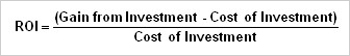
(Image Source: Investopedia)
Continuous conversion rate improvements
This is an important principle to keep in mind for your optimization efforts, and it ties into the problem with the "assumption" angle. Optimizing conversions is about increasing your conversion rate, so when you aren't getting any conversions, it seems appealing. Let's say, as a result of your efforts, you go from a rate of zero percent to something like two or three percent. That's a pretty solid conversion rate! But at this point, most people get lulled into a state of complacency; they believe they've done a good enough job, and they don't strive to get even more conversions or try to get more leads. The truth is, your conversion rate can almost always be higher, but you have to keep striving for improvement if you want to see those rates budge. Getting complacent with your conversion rate, no matter how high, will stifle you from attaining an increase in profits and when you're trying to grow your business, that's the wrong move.
Starting With the Research
Before you get involved with a campaign, you'll be conducting significant research to ground your campaign direction in an objective vision. There are many types of research you'll need to consider:
Market research
First, you'll need to really get to know your target audience. You'll need to learn what's most valuable to them, what makes them take action, and what kinds of elements appeal to them. Hopefully, you already have a good understanding of this from your business planning and marketing efforts, but it doesn't hurt to do another run-through to consider how your audience behaves in a conversion-oriented context. This is the point where you'll be asking these people for their money or their personal information, so you should know them pretty intimately before you start making any changes. If you've already been in business for a while, start analyzing the demographics of your current customers. To reach your conversion goal, what better resource to consult than existing customers?
Competitive research
You'll also want to look around at your competitors and see what they're doing. You may or may not be able to discern how well they're converting (as most sites don't publish their web page conversion rates), but you will at least get some ideas for how to start marketing to your target audience. Even with your limited familiarity on the conversion process, you'll be able to distinguish between competitors who have invested in their conversion plans and those who haven't. Take a look at the conversion investors, and carefully evaluate the tactics they use to convert bigger percentages of their inbound traffic. Essentially, they've already done some of the work for you.
Conversion rate best practices
CRO best practices remain more or less the same, but marketing is also an ever-changing industry. Before diving into your campaign, it's a good idea to cruise around blogs specifically dedicated to helping you increase conversions. The SEO blog, of course, has a number of topics related to earning more revenue for your brand, but you'll also want to check out blogs like Unbounce and Hubspot. This guide is meant to be an all-in-one resource for CRO, but just as you can "always do better" with a conversion rate, you can always learn more about the process.
Copywriting is an essential part of your CRO strategy
Once you start generating traffic to your web site, your conversion rate will depend on your ability to convince people to take a desired action. Persuasive copy is one of the most essential conversion rate optimization tools to achieve this goal. Copywriting aims to persuade your leads to convert once they land on your web page. For example, persuasive copy convinces leads to download a freebie, request a consultation, make a purchase, or start a free trial. These are just some examples. Not all conversions turn leads into paying customers. Any action you want visitors to take can be considered a conversion. Persuasive copy is part of your landing page content, but also your headings, titles, and call to action buttons. You’d be surprised at how much of a difference can be made just by altering the text on your buttons.
SEO copywriting vs. CRO copywriting
You might already be familiar with SEO copywriting. This is where you tailor your copy to appeal to search engines. The goal is to make sure Google, Bing, Yahoo, and other search engines know your content is valuable to visitors searching for specific phrases. Good SEO copy will help you rank higher in the search results pages and a well-optimized meta description will get you a higher click through rate (CTR). This is important and will bring you website visitors, but it won’t get you conversions. To generate more traffic to your web pages you need SEO copywriting. To increase your conversion rate, you need CRO copywriting. This is basically another term for sales copy. Effective sales copy will improve how well a landing page converts, whether you’re aiming to generate leads, sales, or anything else. Effective sales copy speaks directly to your visitors and promises to solve their problems or provide them with something they find interesting. In order for sales copy to be persuasive, you have to know your market inside and out. You need to know what they want, what they don’t want, and how to persuade them to buy from you or sign up for your email list.
Persuasive copy is essential for your commerce site
If you run an ecommerce site it’s critical that your copy be persuasive to maximize your conversions. An online store is different from a physical store. People can’t ask you questions so you can’t address a customer’s concerns directly. Instead, you have to provide all the information they need right up front. A good copywriter can tell your web site visitors everything they need to know with as few words as possible. Visitors to an ecommerce site are more likely to be closer to being ready to buy than visitors to your blog pages. If someone's browsing around your online store, they're likely researching your product, your brand, or looking to make a purchase. Although your website copy needs to be persuasive, you also need to make sure it's optimized for mobile visitors with an appropriate font size and you'll want to use simple language. Marketing experts recommend sticking to a 6th grade reading level to make your copy easy to read. Your goal is to quickly convince the reader to take action, not to impress them with fancy adjectives.
You need CRO copywriting for your PPC ads, too
If you’re running a PPC ad campaign, your ads and ad headlines will generate higher conversions when written intentionally. Professional copywriters specialize in writing ad headlines that get clicks. The one thing you need to remember, though, is to make sure each landing page matches your ads. You’ll only generate conversions when your landing pages deliver on your ad’s promise.
Focus on conversions first, then traffic
It’s ideal to make conversion rate optimization (CRO) your priority over generating more traffic to your web pages. If your conversion rates aren’t already high, getting more of the same type of traffic will just dilute your numbers further. Instead of focusing on generating more traffic, zero in on your conversions. Do some research to figure out why your traffic isn’t converting and then make the appropriate adjustments to how you source your traffic.
Aim for targeted traffic
Target your traffic intentionally. You don’t want the wrong people in your conversion funnel. No matter how well you work on your page optimization, you won’t get as many conversions when your traffic isn’t targeted. If you haven’t already, install Google Analytics to see where your traffic is coming from and how they interact with your web pages. Insight from Google Analytics can tell you about your ideal visitors based on their demographics and referring domains. You can also see where people bounce. For example, if you notice a high bounce rate from your pricing page, your prices might be too low, too high, or your target audience might be off. You also might not be generating traffic from people who are ready to make a purchasing decision. Targeted traffic takes your target market into account on a highly specific level. Chances are, if your conversion funnel is lacking success, you’re not targeting people with enough specificity. Basically, you want to revisit your initial research to find out everything you possibly can about your target market. What are their fears, insecurities, problems, or hangups? Find out what problem they’re hoping to solve with your product. If your product doesn’t currently solve any real problems, that could be the issue. However, chances are, you’re just not creating sales copy that speaks to your market’s pain points. The bottom line is that targeted traffic generates more conversions because targeted traffic wants what you’re selling. Regardless of what you want your visitors to do when they land on your site, only targeted traffic will generate conversions. Imagine selling used ice hockey equipment and finding out that most of your visitors have been roller hockey players. You’ve been targeting “hockey players,” but you’ve been generating the wrong kind of hockey players. Since you weren’t specific enough, plenty of people belonging to the wrong group found your site and bounced. However, all you have to do is start targeting more specific keywords that relate to ice hockey only. Then, your traffic will be more targeted and you’ll get higher conversions.
Calculate your conversion rate regularly
Since conversion rate optimization (CRO) involves multiple components that get altered frequently, it’s important to calculate your conversion rate on a regular basis. Every time you perform page optimization or even change your contact details, run a report to see how your changes might be affecting your conversions. It might not be a statistically significant change, but you’ll never know if you don’t run regular reports. Sometimes changes to a single page can dramatically impact your conversion rate. It could be a less-efficient call to action or even a sub-optimal button color. It could also be that your product pages aren’t displaying properly because you’ve switched themes.
Track your paid ad campaigns meticulously
It might be convenient to run paid ads without separating multiple campaigns, but that would be a bad idea. The more you separate and isolate your ads, the better you can track them along with the traffic to your website. Additionally, you can target more specific demographics when you run separate ad campaigns. If you’re already using Google Analytics, then you can easily see when visitors come to your web pages from your paid ads. Your paid ads play a significant role in your conversion funnel, so make sure you track your efforts down to the last detail. Hopefully, you’re running split-testing campaigns and are testing out a different call to action across different versions of your ads. Sometimes a call to action makes the difference in getting clicks.
AB Tests & CRO Experimentation
You have to keep working to improve your conversions, or else your campaign will stagnate, and you'll miss out on some extraordinary potential. This section will explain the importance of experimentation, testing, measurement, and analysis in your campaign for better long-term results. A/B testing, also known as split testing, is the best way to determine which of your changes are making the most difference. The best part is you can split test your pages on an ongoing basis so you'll always be making progress.
The Importance of Experimentation
When you want to increase your conversion rate, it's not enough to opt for an "optimized" conversion strategy. You have to put your changes to the test in a live environment—and more than that, you'll have to commit new changes to gradually improve your results as a kind of ongoing experiment. There are many values to ongoing experimentation:
Discovering new conversion tactics
First, experimentation forces you to discover new tactics. When you force yourself to find new things to change, you'll tweak things you hadn't before considered. The resulting changes in your data—for better or worse—will lead you to new insights and new angles to which you were previously oblivious. It's the only way to keep moving forward.
The unknown unknowns
Experimentation also helps you discover the "unknown unknowns" of your campaign, and illuminate some false assumptions you may unwittingly hold. As a simple example, you might assume that the position of your CTA in the top-right corner of the site is the best place for it, but through experimentation, you may learn that the top-left is actually superior. You may also encounter data outliers, or surprising results that illustrate a new dimension of your audience, or your brand, that you can learn from.
Keeping pace with audience changes
Web design trends change quickly because audiences are always demanding something new. New devices, new fads, and a rapidly shifting digital landscape make it hard to keep up with your audience. A constantly revolving cycle of experimentation can help you stay ahead of your audience—or at least keep pace with them.
Staying ahead of the competition
Your audience isn't the only group that's constantly changing. In all likelihood, your competition is already ahead of you, experimenting with their CTAs and iteratively improving their conversions. If you want to stay ahead of them, and become more relevant to your shared audience, you'll need to apply some changes of your own.
How AB Tests Work in Conversion Rate Optimization
One of the most effective ways to experiment is the classic AB test, so named because you'll be comparing two different versions of your website, landing page, or CTA—the "A" version and the "B" version. This test is effective because it boils down your results to a simple apples-to-apples comparison, allowing you to determine what it is, precisely, that does or doesn't work.
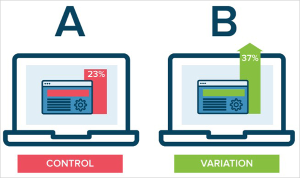
(Image Source: Optimizely)
Essentially, you're going to follow the scientific method here. you'll come up with a hypothesis; for example, you might decide that a change in font could increase conversions, or that a new image is what your CTA needs to get better results. Then, you'll design a test that puts that hypothesis to the test, keeping your "A" version the same and applying the desired change to your "B" version. You'll put both into a live scenario, compare your results, and form a conclusion about the effects of your change—and then repeat this process indefinitely as you come up with more hypotheses for improvement.
Conversion Rate Optimization AB Test Best Practices
Though simple in concept, there are a handful of best practices you'll need to follow for your AB tests if you want to use them effectively:
Make one change at a time
Just like in any math or science application, you need to isolate your variables. If you change too many things between your A and B versions, you'll have a hard time determining which of your changes was actually responsible for the differences you observe. Try to keep as many variables as you can consistent between the two—including your traffic sources and timing.
Know your success metrics
Remember, every business is going to have different goals and different ideas of success in CRO. Are you striving for a greater number of conversions? A higher quality of leads? More user information without sacrificing your conversion rate? There are many possibilities to aim for, but you have to be aiming for something.
Compensate for variables
Understand that your results aren't going to be perfect. If one of your tests gets 100 conversions and the other gets 105, this isn't a significant enough difference to warrant a change, necessarily; this could be due to random fluctuations in your population. If you're ever in doubt, repeat the test under separate conditions and see if your test holds up.
Ongoing Measurement and Analysis
Independent of your AB tests, you'll want to keep a close eye on your conversions, which you can do by setting up Goals within Google Analytics. Getting good results in a test is a solid start, but it's a good idea to pay attention to your long-term trends. Changes in competition, seasons, trends, demographics, and traffic sources can all have an effect on your conversion rates, so watch for these fluctuations and monitor your performance over time.
Calculating Conversion Rate ROI
Occasionally, you'll want to take a pulse of your overall marketing ROI. You can tap this metric easily once you have a good handle on your conversion rates:
Estimating your spend on traffic
First, you need to estimate your total spend on attracting new traffic. Depending on your approach, this can range from simple to difficult. For example, if you enlist the services of a full-service marketing agency, all you have to look at is your monthly expenses. However, if you leverage contractors and full-time workers, you'll have to factor in time and employment costs as well.
Knowing your conversion value
Next, you'll need to know the average value of your conversions, as well as how much traffic you see. I covered calculations of conversion value in a previous section, so you should be able to obtain this figure easily.
Calculating total value
Next, compare your visitor value—which you can find by multiplying your average visitor value by your total number of website visitors—to your marketing expenditures. Are you earning more than you're spending? Good. If not, then it's time for a change.
Improve Conversions with SEO.co
Conversion rate optimization is one of the best marketing strategies you can pursue because it, by extension, can improve the return of all your other marketing strategies. As you bring in more traffic with tactics like SEO, social media marketing, or even paid advertising, conversion rate optimization will help you maximize the potential value of those website visitors. Everything in marketing comes down to revenue, and conversions are the final gateway in getting that revenue. Don't underestimate the importance of your conversion rate optimization strategy, and remain committed to your ongoing improvements. We specialize content marketing and link building services. Check your backlinks today with the help of our free tool!