SEO & Google Analytics: A Comprehensive User Guide
 Timothy Carter
Google Analytics is any search marketer’s go-to tool of choice. Google Analytics is the Swiss Army Knife of the online entrepreneur. It’s full of detailed insights and information you can use to analyze your online traffic and perfect your approach to earn the most new customers and the greatest amount of recurring revenue. But many business owners fail to use Google Analytics to its full potential, relying solely on inbound traffic figures and never venturing further into the platform.
Beginner's Guide to Google Analytics
Unfortunately, the descriptor of it being “user friendly” isn’t entirely accurate. To the seasoned universal analytics user, it’s a platform that’s easy to navigate and interpret, but there are two main situations that prohibit its effective use:
- Tech novices (sometimes called tech illiterates) may struggle to learn how the system works.
- Tech pros (who know how the system works) may find themselves overwhelmed with information, unsure of what to use or how to use it.
This guide aims to make sense of Google Analytics from a beginner’s perspective.
First Things First
Before you can do anything, you have to set up an account. To do so, you can use an existing Gmail account or set up an entirely new one. Either way, head over to Google analytics basics itself and complete the remaining steps of the Google Analytics portion of the Google analytics account or many Google analytics accounts activation. I promise, this part is easy. Next, you’ll need to use a Google Analytics tracking id to ensure that Google or search engines can “see” that how much traffic is on your site. Head to “Admin”; on the left-hand side, select the drop-down menu and select “Create new account.” This will prompt you for a few fields of information, such as the name of your site search, the URL, and your time zone.
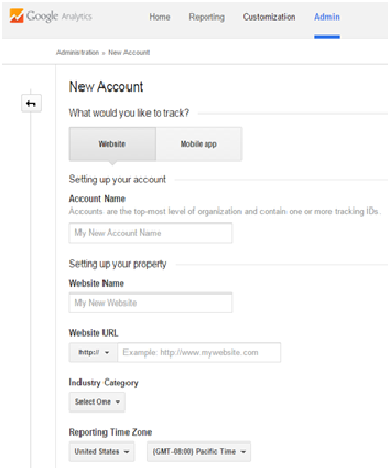
Once complete, you can click “Get Tracking ID or Google analytics tracking code,” and you’ll be presented with a short snippet of code you’ll need to paste on every page of your website. If you have an SEO plugin, this should be easy. If not, you may need to request assistance from your web developers.
The Basics of Reporting
The “Reporting” tab is where you’ll spend most of your time. You can get here from the home screen, by clicking on your website (if you have multiple websites to track, you’ll have to click on one at a time). On the left-hand side, you’ll see a collapsed menu of different items, which we’ll be exploring one by one. Consider this your home base:
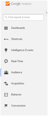
Dashboards
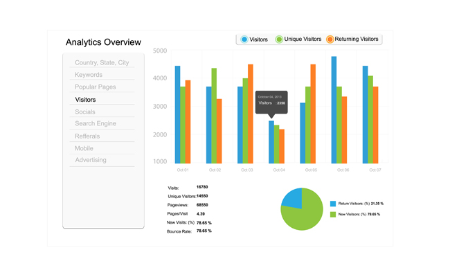
If you’re just getting started, you can ignore “dashboards” altogether. With this section, you can create customized interfaces to display only the most relevant data for your particular site, or multiple dashboards for multiple respective purposes. Shortcuts Shortcuts, similar to dashboards, exist to make your life easier as you use Google Analytics more regularly. For now, ignore this section, but remember it’s here when you start making the same types of reports over and over again. Intelligence EventsThis section exists to alert you of various happenings on your website, broken down into daily, weekly, and monthly events. For example, you might receive an alert that your “pageviews” increased by 100 percent over the course of a week. You can also set up custom alerts for specific events on your site. Real-Time Real-Time offers, as you might imagine, a real-time snapshot of who is visiting your website. Among other data, you’ll see where they’re browsing, what pages they’re visiting, and whether or not they’re converting. Audience The Audience section is one of the most useful in the platform. Here, you’ll be able to see exactly what type of active users visit your website. You’ll be able to analyze them based on demographics like age and gender, their geographic location, and even the types of devices they’ve used to access your site. By studying this information, you’ll get a better idea of who is using your site, as well as whether or not they were satisfied with the experience (by segmenting portions of your audience and viewing metrics like bounce rates). Acquisition The Acquisition section is the most important one for inbound marketers. Here, you’ll be able to see a breakdown of all your main sources of traffic, and how those sources compare against each other and evolve over time. Generally, you’ll want to pay attention to the big four sources: direct visits (which involve typing in your URL directly), organic visits (which are increased as you increase in Google search console rank and visibility), social visits (which measure people visiting your site from a social media platform), and referral visits (which involve people clicking external links to get to your site). You’ll also be able to view detailed visit information based on these individual sources, such as average session duration and pages per session. Behavior Your Behavior report is most useful for analyzing the effectiveness of your website overall. Here, you’ll be able to analyze your total pageviews, determining where your traffic usually lands, and what actions they take from there. The Behavior Flow chart, available in the submenu, is a great way to visualize the average path a user takes through your site. With this report, you’ll be able to determine which design areas of your site are most and least effective. Conversions Last but not least, you’ll be able to measure the conversions you get onsite. Obviously, the more conversions you can get, the better—so if you notice this number growing, you know you’re doing something right. Before you can dig deep into the metrics, however, you’ll have to set up some initial Goals. You can do this by selecting Admin, and then selecting Goals on the right-hand side. It’s a relatively straightforward process.
More Advanced Features
You aren’t limited only to what we covered in this guide, of course. There are many other features, customizations, and tricks to learn as you become more adept at use Google Analytics. This is just an introductory guide, to help you get started and make sense of your data. If you’re interested in more in-depth information, Google offers a fairly robust training guide.
Conclusion
Google Analytics tools are the most robust of all website analytics tools on the Internet. Simple to deploy and easy to use, the number one website analytics platform or Google Analytics offers volume features for marketing analysis and marketing efforts. The Google Analytics platform generates reports about website front-page performance. It provides real-time and historical insights on your site’s SEO performance, including a breakdown of traffic sources and active users behaviour. With the information provided by Google Analytics, it’s possible to learn from your campaign and make adjustments to improve your performance, but if you want to truly perfect your strategy, Google Analytics isn’t enough. There are serious gaps when it comes to keyword research, competition analysis, and visibility into factors that affect your ranking. That's where we come in. Get in touch with us today!