How to Optimize Your Website for Mobile Devices
 Samuel Edwards
Optimizing for mobile SEO isn’t complicated, but it isn’t always as simple as flipping a switch. There’s no single patch of code or button you can push to magically alter your site to be compatible with mobile devices. However, you do have several options when optimizing for mobile devices.
Mobile Responsive Websites
Responsive websites are optimized for mobile at a design level. They are created in such a way that allows the components of the page—such as the banners, blocks of text, headlines, and so on—to organize themselves on the page based on the size of the screen that’s accessing the webpage. These components may flex or stack to accommodate a smaller screen size, so a desktop user and a mobile user would both be able to easily navigate the site (even though the layout might be different). There are a number of advantages to responsive websites. Since the design is flexible enough to adjust to any screen, every type of mobile device will have a customized experience. However, the “responsive” element only needs to be built once. There is only one URL for your website, which makes it easy to develop and easier to manage over time, and it’s relatively simple to implement. The loading times for responsive sites tends to be slightly slower than the other options, but that’s generally a small price to pay for a universally adaptable website.
Mobile URLs
Mobile URLs are exactly what they sound like—they’re separate, customized URLs that exist for the mobile version of a webpage. For example, if your traditional website was www.example.com, your new website could be www.mobile.example.com. Whenever a user accesses your site using a mobile device, you can automatically re-point them to the mobile version of your site (and provide a link to toggle between these versions, just in case a user wants to switch). Mobile URLs are starting to become antiquated, but they’re still useful for some businesses. They take more time to create than a responsive design, since they require an independent creation, and require more extensive ongoing upkeep. They’re also vulnerable to fault points in the redirect system—if you accidentally direct a mobile user to the desktop version, they may have a poor experience.
Dynamic Content
The third option for mobile optimization is closer in theory to responsive design. Like with a responsive design, dynamic content structures require a single URL to house both a mobile version and a desktop version. The difference is, in a dynamic content setting, you’ll have twin versions of your site—the desktop and mobile versions—ready to display based on the type of device and screen size trying to access them. This is an improvement over mobile URLs, since you’ll only need to manage one URL, and you won’t have to worry about creating and sustaining a redirect. However, there are some flaws that may prevent you from achieving the best results. Creating one mobile version can be problematic, since there are hundreds of different mobile devices that could theoretically access your site.
Ensuring Google Approves of Your Mobile Site
Before you start trying to optimize specifically for a mobile experience, you have to ensure that Google approves of your mobile site. That means having your website perfectly capable of loading when accessed by mobile devices. There are three types of mobile layouts that are considered the standard for modern websites: responsive designs, dynamic content, and mobile URLs. All three are viewed equally by Google, but some webmasters may have a preference for one over the others. Responsive Design A responsive design is one that automatically detects the type of device being used to access it, and adjusts the layout of the site accordingly. For example, if your site is being accessed from a desktop machine, it may display traditionally, but if it’s being accessed from a smaller, vertical smartphone screen, it might “stack” some of the horizontal features to maximize the user experience. Responsive designs use one URL and one design, which makes it very convenient and efficient for developers. It’s relatively easy to incorporate, and it consolidates an otherwise multifaceted development effort. The only potential drawback of the responsive web design is loading time—since mobile users will technically be loading the entire site, it may take longer to download than a specific mobile landing page. Still, responsive design is the most popular mobile option today. Dynamic Content Dynamic serving content is similar to a responsive design, since only one URL is used no matter what type of device is accessing the content. However, under dynamic content, you’ll actually be serving up totally different versions of your website. For example, you’ll have a “desktop” version of your site loaded up and a “mobile” version of your site loaded up, and you’ll serve the version that corresponds with the device trying to access it. This allows you to serve each device more specifically. However, it takes much more work to develop, implement, and manage since you’ll need to create a version for almost every type of device that could access your page. Mobile URLs Mobile URLs are an old-fashioned way of getting your site optimized for mobile devices, but they still work fine for some businesses. Rather than trying to adapt on the fly the way responsive designs do, with mobile URLs, you’ll essentially be building a separate, mobile version of your site on a different URL. When a user access your site from a mobile device, you’ll automatically redirect them to the proper URL, usually a variant of your primary URL. Mobile URLs are typically more difficult to manage. You’ll have to ensure that your desktop and mobile versions redirect appropriately, which can be difficult. Otherwise, your users will view an inappropriate version of your website, and they may be left with a terrible first impression.
Optimizing for Mobile-Specific Searches
Users searching on mobile devices, like smartphones, are searching using the same index as desktop or home searchers. That means, as long as your site is present on that index, both desktop and mobile users will be able to see you. However, there are a handful of specific search engine rankings on mobile devices that will interfere with your rank:
- Desktop and Mobile Presence. Google tends to favor sites with both a desktop and a mobile presence. If you only have a mobile site, you aren’t going to rank as high, even if the majority of your searches are on mobile. Make sure your links are suitable for both desktop and mobile loading.
- Page Loading Times. Page loading times have always mattered—the faster your site’s pages load, the higher your site is going to rank. But on mobile, the preference for fast-loading web pages is even more extreme. Google recommends loading above-the-fold content in under one second. Optimize your loading speed for mobile as much as possible.
- URL Redirects. Redirects are an important part of many sites, and an unavoidable one in many circumstances. However, adding a redirect essentially adds more time to load the destination page, which means a lagging user experience, and a lower rank as a result. Avoid redirects as much as you can.
- Annoying Popups. It’s tempting to include an overlay page or a popup ad on your mobile site, especially if you’re trying to get users to download your mobile app, but Google has a firm belief that such advertising efforts are damaging to overall user experience, and as a result, you could rank lower if you feature one. You’ll have to make the call as to whether the increased conversion rate from the popup ad or the increased traffic from the higher rank is more important.
- Full Content. Your webpages can’t just be partially mobile optimized for mobile phones. If there are any areas of your page that aren’t optimized for mobile—such as flash animations or a video that won’t play—your ranking for mobile searches could drop as a result. Be sure to check every nook and cranny of your pages for potential non-optimized content.
How to Adjust Your Current SEO Strategy
For the most part, mobile SEO is going to function the same as traditional SEO. You’re still going to function on user experience, onsite content, offsite backlinks, and the same navigational improvements that lead to higher ranks. In terms of your ongoing strategy, there isn’t much you’ll need to improve on as long as your strategy is currently in order. To start things off, you’ll need to optimize your website for a mobile layout. Mobile readiness should be a focus of your website launch from the beginning. The specifics are up to you, but you’ll need to ensure that your site loads appropriately and quickly—perform multiple tests on multiple devices to ensure that your site is loading the way it should, and don’t hesitate to consult Google Webmaster Tools to see if your site is registering as optimized for mobile. From there, you’ll need to do periodic tests for your page loading times and to ensure that the full content of your site is available on all mobile devices.
The Best Option
Google doesn’t care how you optimize your website for mobile, as long as it is optimized in some way. Whether you choose responsive, mobile URLs, or dynamic content, Google will consider your site optimized for mobile, and you’ll rank accordingly. Your users likely won’t care what type of mobile-optimization strategy you use either, as long as you’re giving them the best possible experience. That being said, your decision should come down to your own personal preferences. From a technical standpoint, responsive designs are generally the cleanest; they only require one redesign to be complete, and the ongoing maintenance is pretty much nonexistent, at least compared to dynamic content or mobile SEO URL strategies. Plus, you’ll eliminate the vulnerability of failing to accurately judge the type of device being used to access it.
Improving Your Rank in Mobile Search Results
After optimizing your design and structure for mobile, there are a handful of ongoing strategies you can use to boost your rank in mobile searches, even beyond the strategies of a traditional SEO campaign:
- Decrease your page loading times. Mobile devices load pages slower than desktop versions. Make sure your mobile design is mobile optimized for SEO site speed and lightning-fast download times.
- Keep plenty of content on your pages. Since mobile users need things quick, it may be tempting to reduce your on-page content, but keep as many words on the page as appropriate to maximize the amount of content Google can crawl.
- Avoid the temptation to use pop-ups. Pop-up ads are seeing a resurgence, especially for companies trying to push their mobile application specifically to mobile users. Doing so can devalue user experience, increase page loading times, and decrease your domain authority in Google’s eyes.
Now that the “mobile landscape” is out of the way and you have a good idea what you can expect from mobile optimization, let’s dig into the details of exactly what mobile optimization entails. These are mostly a series of onsite changes that you can implement to make your site appear and perform better on mobile and alternative devices, but there are many options when it comes to implementation and of course, testing.
The Basics
Let’s start with the basics. These are hallmarks of mobile optimization that you can’t ignore, and following all of them will put you in pretty good shape to be qualified as “mobile-friendly:”
- Don’t block CSS, images, or JavaScript. These are all coding elements or types of content that you may be tempted to block from Google search crawlers, or otherwise disable for your users, to ensure a good mobile experience. You need to keep all these elements present and available to Googlebot (as well as other search crawlers) or you’ll run into indexation problems. All the mobile optimizing and high-quality content in the world won’t do you much good if Google isn’t indexing your site in the first place.
- Ensure all your images and videos load properly. This is a crucial step, as most mobile browsers and devices function differently than desktop-based means of accessing content. You may find that on some mobile browsers, your content loads perfectly fine, but on others, all you see is a “file not found” or similar message. This is bad news, both for human visitors and for search crawlers, so if you discover one of these compatibility problems, you’re going to need to update your site. You’ll also want to make sure these images and videos are loading quickly, but that’s a separate bullet point altogether.
- Make your text visible without zooming or scrolling. One of Google’s biggest concerns with mobile-friendliness is the convenience and navigability of your site. Design is important, but realistically, your text is the most important material on your site. If users have a hard time reading that text, your site isn’t doing its job, so to optimize your website for mobile, you need to ensure that all the text of your site is visible (i.e., readable) without the need for users to zoom or scroll horizontally. Take a look at this handy guide image Google created, illustrating how you can rearrange a site to better present your written information to mobile users:
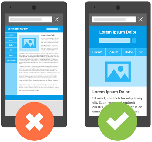
(Image Source: Google)
- Make buttons finger-clickable. No matter how much you love using your mobile device, you have to admit that the precision of an old-school computer mouse handily out-performs the clumsiness of your own fingers. When it comes to buttons, menus, dropdowns, choices, and other interactive elements, precision is notoriously difficult. If you want your site to be mobile-friendly, all those actionable elements need to be easily navigable with fingers. There’s no hard rule for this, such as the recommended size of a button, but you can generally rely on your best judgment. Test it and see how you’re able to fare with your own fingers—this is more intuitive than it is programmatic or mathematical.
- Improve your page loading speed. Page loading time is a significant website factor, primarily for user experience but also for search ranking potential. Have you ever been to a webpage that takes longer than a second or two to load? It’s terrible. We should be ashamed of ourselves for our low attention spans, but it’s terrible. If your site takes too long to load, your users won’t even give you a chance, so keep your site as lean as possible by using the right image formats, reducing your multimedia sizes, clearing old drafts and meta data, and using a good caching plugin. The problem is compounded on mobile devices, since Internet speeds are usually much lower, so you’ll have to do double duty here.
- Avoid Flash. Thanks in part to Apple’s crackdown on Flash compatibility in iPhone (and similar) devices, Flash is pretty much obsolete these days. Unless you have some niche function that literally can’t exist without Flash, or an already-dedicated user base, there’s no excuse to continue using it. It won’t load properly on mobile devices, and it’s only going to grow more archaic as the years roll on.
- Avoid pop-ups. Some pop-ups can be valuable, such as prompts to sign up for an email newsletter, but as much as possible, you’ll want to disable these on mobile devices. Pop-ups are somewhat annoying on desktop devices, but on mobile devices, they’re even worse—not only is it harder to click them away with a finger, there’s also the likelihood that you’ll miss-press and end up loading a bulky page you didn’t intend. Don’t put your users through this experience unless you have to.
Going Above and Beyond
The above “best practices” are the basic ones you’ll need to comply with Google’s mobile standards and get your site seen as “mobile-friendly” by search engines. However, that doesn’t necessarily mean your mobile optimization journey is complete. Meeting the basic requirements will help you appeal to search engines, but you also have to bear your users in mind. Yes, meeting the above thresholds will be valuable for users, but if you really want to sell the experience of your site, you’ll need to go above and beyond the line of duty:
- Maximize loading speed. Don’t just strive for a slightly faster mobile website—try to outdo all your competitors here. If you can get your page loading in a second or less, your users will notice the difference. If you have lots of images to show off, this can be difficult, but you can still strive for on-page minimalism. Keep your content lean and focused, and reduce your image sizes as much as possible without sacrificing the quality. Get rid of any plugins on your backend that you aren’t currently using, and make sure your caching plugin settings are mobile optimized for page performance.
- Design specifically for mobile experiences. There’s a difference between taking an existing mobile website and shoehorning it into decent mobile experiences, and designing specifically for mobile experiences. Unless you’ve done the research to prove that your target audience still uses mostly desktop devices (and plans to stay there indefinitely), it’s a good idea to redesign your mobile website from the ground-up for your mobile audience. That means arranging all your content vertically, redesigning interactive functions to appeal to small touch screens, and visualizing your site completely differently. If you use an eCommerce platform, this will similarly need updating—there are many user interactions here, and mobile user interactions can make or break the experience.
- Test and evaluate differences in user behavior to improve. Don’t just assume that your changes will be valuable to mobile users; you can use a degree of intuition to help guide your creativity and reaffirm the benefits of your changes once they’re actually applied, but don’t neglect the follow-up of measuring your user behavior. How are your users interacting with your site? Are they engaging the way you thought they would? Can you strive for something even better? Don’t be afraid to make iterative tweaks here, gradually building up your overall mobile performance.
Implementation
Aside from smaller factors like optimizing your images, there are three main ways you can implement broad mobile changes to your website:
- Responsive design. The first, and most important, is what’s known as “responsive design.” This is the method currently favored by Google, and it’s one of the easiest to implement. It also gives you the most flexibility of any of the three options, and is the easiest to troubleshoot if something goes wrong.
Essentially, the idea here is to code your site to automatically detect the size of the screen viewing it and adapt its material accordingly. For example, you might have a desktop layout like the one on the left in the diagram below, but when a user tries to access the same site on a mobile device, the site with “sense” it, and rearrange its components to be viewed conveniently.

(Image Source: Google)
This may seem space-aged or incredibly difficult to incorporate, but the reality is, there are many responsive options available these days. In fact, if you have a WordPress site, or use any popular CMS, you can easily find a free responsive template on which to build your site. It’s super popular for a reason.
- Dynamic serving. In dynamic serving, you’ll essentially be creating multiple versions of your site in the backend code. Here, you’ll be able to control—with precision—the differences between how your site shows up on desktop devices versus mobile devices. Though the backend coding is going to be different, your URLs are going to be the same; your server will determine what type of device is being used to access your URL, and will serve up the code that’s most appropriate.
- Separate URLs. With separate URLs, you’ll also be creating a separate version of your site, only this time it’s going to be hosted on an entirely separate URL (usually some variation of your root domain, such as mobile.example.com).
If you’re having trouble visualizing or comparing these methods against each other, here’s a handy chart that Google created to explain the differences:
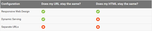
(Image Source: Google)
There are some pros and cons to each method, but ultimately, responsive comes out on top in most scenarios:
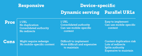
(Image Source: Moz)
Other forms of mobile SEO
When it comes to the search optimization element of mobile optimization, there isn’t much more to be seen. The basic standards of onsite and offsite optimization apply here, and of course you’ll need to come up with high-quality content on a regular basis, but there’s nothing else specifically for mobile devices that you’ll need to do on an ongoing basis.
Testing
Let’s say you’ve done everything I’ve outlined above—even the “above and beyond” stuff—and you’re confident that your site is sufficiently optimized for mobile. Just how confident are you? Are you willing to bank the visibility of your website on it? Even if you feel supremely confident, it’s important that you test your assumptions.
Device Differences
One of the biggest reasons to test yourself is because of the sheer diversity of devices that are currently out there. Each device has its own quirks, layout issues, and rendering issues, and if you want your site to be as mobile compliant as possible, you’ll have to adapt for all of them. Just because your site looks fine on your specific model of smartphone doesn’t mean it’s similarly rendering across the board.

(Image Source: SmartInsights)
- Desktops/laptops. Desktop and laptop devices aren’t ones you’ll have to worry about—at least not generally. If your site is working properly on any other mobile device, it’s probably working just fine on desktops. Besides that, Google doesn’t care much about desktop optimization these days anyway.
- Smartphones. Smartphones make up the biggest market share of mobile users, and are the biggest concern you should have when it comes to site performance. Android, iPhone, and Windows Phone devices all fall under this category.
- Tablets. Tablets generally have screens bigger than a smartphone but smaller than a desktop device, and may be oriented vertically or horizontally. It’s good to know how your site will look in both orientations because of this.
- Multimedia phones. Multimedia phones are ones that can “meet XHTML standards, support HTML5 Markup, JavaScript/ECMAscript but might not support some of the extension APIs in the HTML5 standard.” Generally, any 3G-compatible mobile phone that isn’t a smartphone falls into this category.
- Feature phones. Feature mobile phones can’t render standard websites, and instead rely on things like cHTML (iMode), WML, and XHTML-MP.
Conducting Your Tests
Google is one your side. Google wants your site to be a mobile-friendly website. Accordingly, they’ve developed a handy online test you can use to determine whether or not your site passes their basic standards. Run your site through this test and Google will let you know exactly what—if any—errors or incompatibilities it finds. If you pass this test, you won’t have to worry about any irregularities in your search rank or visibility.

(Image Source: Google)
Even if you pass Google’s standard test, it’s a good idea to run tests on your own mobile phones, or through a service like MobileTest.me, which will allow you to “simulate” how your site appears on different browsers and devices. This is because even officially mobile-friendly sites can have visual hiccups or unpleasant factors in their design that compromise your intentions or show up differently than you expected. Use this stage of testing to weed those errors and fault points out.