Raise your hand if, after launching your landing page(s):
- You see conversions flat line or drop
- Audience engagement with your landing page is paltry
- Your revenues and up-sells as a result of your pages fall
- Your search engine rankings for that page fall
So how on earth are you supposed to tell why your landing page isn’t working? How do you fix it?
In this guide, we present to you 50 possible reasons your landing page isn’t working—with landing page optimization solutions for each.
Table of Contents
Why Landing Pages Matter
If landing pages are so complicated in the first place, why use them?
- Landing pages provide destinations. No matter what types of marketing and advertising you’re pursuing, your users need somewhere to go. Landing pages provide that ideal destination.
- They’re a focal point for conversion. Landing pages give you the opportunity to confront your users with a conversion opportunity, maximizing your potential revenue and/or customer value.
- They allow for segmentation. Because landing pages are separate from your site, you can also use them to segment your target demographics and cater to them individually.
So with all these advantages, why isn’t your landing page seeing better results?
Why You Aren’t Getting More Landing Page Conversions
Let’s diagnose your landing page problem:
1. You haven’t measured anything.
First, ask yourself how you’re able to determine the success of your landing page.
Are you going by a gut feeling? Are you just noticing that nobody has filled out your contact form?
If you aren’t measuring more in-depth metrics, such as how many people are visiting your landing page or what your exit rate is, you’ll blind yourself to the real variables responsible for your performance.
This is inexcusable, especially since so many free tools, like Google Analytics, are on the market. If you haven’t been measuring and analyzing your progress, get started immediately—you’ll need those numbers to measure how effective your correctional strategies are.
2. It isn’t loading properly.
Don’t scoff at this.
You’d be shocked and embarrassed to learn how many people scratch their heads over why more people aren’t converting when their pages don’t load properly to begin with.
Fortunately, this is simple to detect and fix. If you’re looking for the easiest way, try visiting your landing page using as many different devices and browsers as you can think of. Is it loading?
Are all your images viewable?
Is your form easy to see?
Is your page loading fast?
You can use a tool like BrowserStack to help test this.
Otherwise, be sure to check out Google Search Console, which can tell you if your website is down and help you track down the reason.
3. It doesn’t view correctly on mobile devices.
Mobile SEO is a critical feature for your landing page, just like your main website, as the majority of traffic, for many businesses, now comes from mobile devices.
Because landing page layouts are especially sensitive to directing users’ eyes and interactions, it’s vital that your page look attractive and engaging on mobile devices specifically.
- Is the bulk of your content easily viewable?
- Is all your text readable?
- Are your buttons easy to find and click, without zooming?
- Is it able to scroll easily?
If not, you may wish to reconsider your design to cater to these mobile users.
Again, BrowserStack can help diagnose landing page problems here.
4. The buttons or form fields aren’t functioning properly.
Your web form is the star of your landing page; if it isn’t functioning properly, your landing page visitors aren’t going to proceed with converting.
Run multiple tests on multiple browsers and devices to make sure your functionality is intuitive and responsive.
For example
- Is it easy to click into a form field?
- Do you proactively warn your visitors when they haven’t filled out a required field?
- Are your buttons easy to click?
- Do your dropdown menus load quickly and easily?
Any deviation here could be an excuse to abandon your landing page, so don’t take chances.
5. You aren’t targeting a niche audience.

Who, specifically, are you targeting with your landing page?
If you don’t have an answer, or you have a generic one like “our customers,” you’re doing something wrong.
One of the greatest strengths of a landing page is its ability to communicate with high precision to one specific group of people.
If you aren’t taking advantage of that high relevance, your users aren’t going to be engaged.
Think carefully about what niche you want to target, considering your competitors as well as your demographics’ dispositions, and narrow your focus to that audience.
6. Your tone and presentation aren’t appealing to your target audience.
Of course, if you already have a target audience in mind, you could be suffering from a lack of relevance—or an inability to target those users effectively for search intent.
For example, you could be using a vocabulary that’s too high for your users to follow, or so low that it compromises your online reputation.
You could seem too “boring” to your young users, or too “juvenile” to your older ones.
Examine your brand voice carefully as it permeates your landing page, and reevaluate the tone you use.
A good brand can outrank other, more well-known competitors.
7. Your color scheme is off.
When it comes to the colors you use in your landing page, there aren’t many “right” or “wrong” decisions.
However, there are a few best practices you’ll want to follow. For starters, your coloration should be in line with your brand and your industry—if the colors don’t feel like “you,” or if they give the wrong impression, it could interfere with your results.
Your coloration should also enhance your text’s readability—if it makes it hard to read, you’ll deal with the consequences—and it should help to call out prominent areas of the page, such as your call-to-action (CTA).
8. Your design is obsolete.
When was your landing page designed? Who designed it?
The fundamentals of SEO web design have changed significantly over the years, with new trends emerging regularly.
Users have grown accustomed to seeing things like full-sized background images, minimalistic, clear designs, “modern” fonts, tasteful links, intuitive forms of navigation, and easy-to-scroll content.
If your landing page looks like it came from the 1990s, they’re going to be immediately turned away.
If you’re confused about what this means or don’t have anything to compare your site to, take a look at some modern web design examples.
9. Your design is too crowded.
While it’s not an absolute necessity, it’s generally agreed upon that minimalistic landing page designs tend to work better than ones that are overcrowded with information, like the Adobe example below.
Minimalistic landing pages give users space, allowing their eyes to wander naturally and settle upon only the most important parts of your content.
Cramming in too much content or too many features can be both distracting and overwhelming, ultimately leaving your users unsatisfied.
This doesn’t necessarily mean you should limit the amount of content you offer, but you should space it out to give your users ample room to digest it.
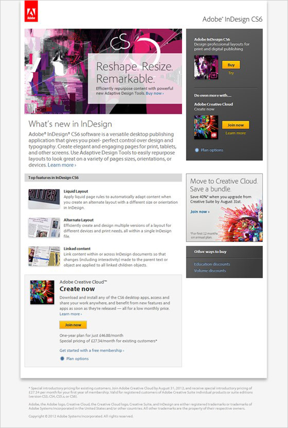
(Image Source: Unbounce/Adobe)
10. Your headline isn’t compelling.
The first line of your landing page, the one that’s most visible when users get there, is the most powerful piece of copy you’ll offer.
If you don’t grab your visitors’ attentions here, you may end up losing them forever.
Your headline needs to be a strong description of what you’re offering, and a compelling reason to stick around and learn more.
Get your users excited, and tell them exactly what they can expect from you.
If you’re looking for inspiration, Unbounce has some great examples here.
11. It’s hard to tell what you’re offering.
Sometimes, visitors aren’t interested in an offer because they don’t understand what it is.
For example, let’s say you’re offering a free trial of your software in exchange for a bit of personal information—but what does your software actually do?
What are the options when the free trial expires?
Why would anyone be interested in this in the first place?
If your landing page leaves any of this ambiguous, it could be a reason for its failure.
12. Your offer isn’t valuable enough.
All conversions are an exchange of value, in one way or another.
If you’re selling a product, visitors are exchanging money for the goods; if you’re generating leads, they’re exchanging personal information for something valuable, like a free consultation.
If your visitors see and understand your offer completely, they may still believe it to be too low a value to proceed with.
As a simple example, if you’re charging too much for your product, people aren’t going to buy it—makes sense, right?
Here, your best option is to use surveys to determine how valuable your offer really is, and make adjustments accordingly.
13. Your form is too long to fill out.
People are impatient, and they want things to happen fast. If your form is too long or too complicated to fill out, they aren’t going to invest any time in it.
There’s no universal rule here, but try to keep your form fields as minimal as possible, such as asking for a first name, last name, and email address.
Feel free to ask for more information, but be ready to back that request up with a better offer in exchange.
14. You don’t have any visual engagement.
Humans crave visual engagement. It’s easier to make a decision based on what we see rather than on what we read, because that’s how our ancestors survived for millions of years.
At the very least, you should have a handful of images that show off your products, like Loot Crate does in the example below.
If you’re not selling products, or if you’re selling something less tangible, consider including other types of images that convey the attitude of your brand or suggest the experience of your services.
And they don’t have to be images—videos work well, too, particularly if you’re really wanting to outperform with video SEO.
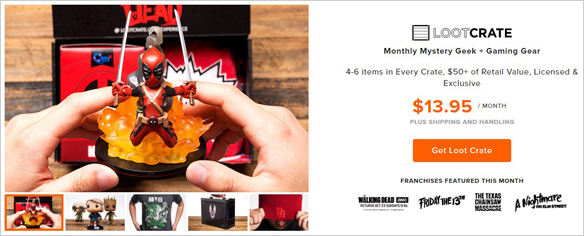
(Image Source: Loot Crate)
15. Your brand is inconsistent or invisible.
Landing pages demand some different approaches than traditional websites, but you still need to have your brand carried throughout.
Your brand personality and values should be evident in the image you present and the voice you use in every corner of your money page if you want to give users a sense of comfort and familiarity.
Even if they aren’t familiar with your brand, this is a powerful way to convince them that this is the type of company they want to deal with—don’t hide that personality.
16. You don’t have information about your brand.
Of course, your brand is about more than just your identity standards. There’s also a history to your brand, and probably a lot more to your company than you can adequately squeeze into the confines of a landing page.
Include what information you can on your landing page without overwhelming your audience, and give them a chance to learn more with a link to a separate landing page or an embedded video.
The information doesn’t need to be there explicitly, but it does need to be available for those who want to do more research on your business.
17. There’s no contact information.
Contact information gives people a sense of security.
When they see a phone number at the top of your landing page, they’re reassured that someone exists on the other end to take care of any questions or concerns they have.
When they see a live chat window, they feel like you care about your customers’ needs.
Even if they don’t use these options, the fact that they’re there makes it more likely that they’ll convert, so if you omit them, it could be a source of your poor performance.
18. You don’t have any trust badges.
Of the 50 things on this list, trust badges probably seem like the most innocuous.
These tiny symbols, proving your affiliation with various trustworthy organizations, may seem inconsequential compared to the functionality of your landing page and the strength of your design and copywriting, but the fact is they have a massive impact on your eventual conversion rates.
If you don’t currently have any on your landing page, consider adding them in, and see what type of effect it has on your performance.
You’d be surprised how many people they can convince.
19. There’s no social proof.

The majority of today’s consumers aren’t satisfied with a company’s proclamation that its product or service is the best—after all, they’re the ones trying to sell you on it.
Instead, people are increasingly turning to social proof to back their decisions.
These are things like reviews, testimonials, and even historical customer data—all of which are third-party indications that a company is worth working with.
If you don’t have any of these soft recommendations and forms of social proof on your site, it could be a root cause of your landing page’s inability to perform.
20. The CTA isn’t obvious.
Your call-to-action (CTA), the main button or final step of the conversion process, should be blatantly obvious to anyone on your landing page.
If it isn’t, it could seriously detract from your ability to achieve conversions.
You can make your CTA more obvious by making it a button (rather than just a link), giving it a color that significantly stands out from the rest of your landing page, making it larger, or even placing it above the fold.
You can even use subtler tactics, like arrows or other directional cues to guide your users’ focus to this area.
21. There are too many distractions.
Enough distractions can ruin even the best landing page.
When designing your landing page, it’s tempting to include as much as possible, such as more information about your brand, other options, or even links to your blog posts and other materials.
However, you need to remember that there’s one goal to your landing page; get people to convert.
Anything other than that conversion opportunity qualifies as a distraction, and may distract your visitors from ever completing the process.
You’ll need to eliminate these distractions if you want to see your conversion rates improve.
22. You have too many options.

Common sense would tell you that more options are a good thing—but that isn’t the case for landing pages.
In fact, sometimes, fewer options can help you achieve more conversions.
When you have too many variants on the same offer, people can get confused and intimidated, but in a selection between two or three choices, there’s usually one standout pick.
23. It’s too similar to other landing pages.
Take a look at your landing page and compare it to some of the other landing pages you see from your competitors (or even your own site).
How similar do they look?
Do they stand out in any unique way?
It’s a good idea to look to other landing pages as sources of inspiration and to see best practices at work, but if you don’t have any unique qualities to make you stand out, you could end up alienating a major portion of your audience.
And you may run into this issue on your own site if you’ve spent time building location specific landing pages for local SEO. If the landing pages are too similar, they may hurt more than help.
As a side note, you can check such location, including international search results using a VPN tool.
Be sure to show off what makes your brand—and your offer—unique.
24. Your landing page seems spammy or untrustworthy.
If you try too hard to sell to your visitors, your site could come across as spammy, unprofessional, or untrustworthy.
Gimmicky companies have used spammy, deceptive landing pages to trick people into buying products for years, so consumers have become hyper-sensitive to tactics like flashing lights, big promises, and excessive use of exclamation points.
Make sure your landing page looks professional and approachable.
25. Your customers simply aren’t ready to buy.
Almost every buying decision occurs in several stages.
Customers learn about a problem their facing, then learn about potential solutions, then learn about the companies offering solutions.
If you offer a solution to a problem your audience doesn’t know they have, they aren’t going to convert.
That means you need to make one of two changes; either refocus your target audience to get people in the right stage of the buying cycle, or change your offer to target the types of users you’re getting.
26. You don’t have a clear UVP.
Your unique value proposition (UVP) is a single, concise statement that explains why your offer is important and how it’s differentiated from the competition in a single go.
It can be hard to come up with, and even harder to present to your audience in a clear, effective way, but it’s something you need if you want your landing page to become effective.
You can use this statement as a headline, or a main focus somewhere else in your copy, but it should stand out to your incoming visitors.
27. You haven’t listed the advantages of your product or offer.
It’s not enough to describe what you’re offering.
You need to describe the effects of what you’re offering—essentially, you need to explain why your customers would benefit from purchasing this product or taking you up on this offer.
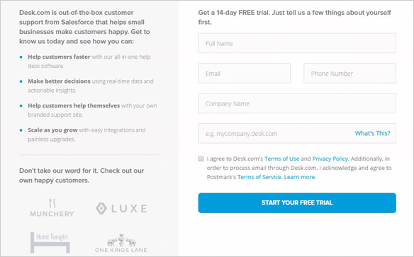
Desk does an awesome job with this in the example below; it reduces its complex and multifaceted software to a series of four main improvements.
Keep this list accurate, concise, and simple—the flashier you are, the less convincing you’re going to be.
(Image Source: Desk)
28. Your landing page copy is unprofessionally written.
This may be a hard one for you to judge, especially if you’re the one who wrote it, but if your landing page isn’t performing, it could be due to an issue with the professionalism of your content writing.
Any single typo, like a spelling or grammatical error, could cause some users to stop trusting you; after all, if you can’t proofread your own landing page, you probably aren’t quality-checking your products or services.
Any clunky, awkward, or poorly written sentences could also contribute to this image, so keep your copy as tight as possible to maximize your potential for success.
29. Your landing page copy is too sales-y or pushy.
It’s unfortunate that many marketers resort to hard-selling tactics and sales gimmicks to try and earn more conversions.
Today’s audience is sick of hearing sales speak, and they’re tired of seeing advertisements.
If you try to bully your visitors into converting, they’re not going to comply—they’re just going to leave. Instead, it’s better to be as direct and honest as possible.
30. You use too many big words or buzzwords.
In that same vein, your visitors may be distrusting you if you use too many big words or buzzwords.
Even if your vocabulary matches your target audience’s, excessive use of big words may make it seem like you’re overcompensating for something, and using too many buzzwords makes you sound lazy and unoriginal. Instead, try not to overthink your writing too much.
Explain yourself in brief, simple sentences, again being as direct as possible.
31. Your landing page doesn’t have enough visuals of your offer.
I already mentioned the importance of having strong visuals earlier in this guide, but here this tip extends specifically to your product or service.
People want to see what they’re getting—even if it’s just a hint of it.
Establish your visitors’ expectations by showing them a product demo video, or a slideshow of images from different angles, or if you’re offering something digital like an eBook, show them some screenshots or a previous example of your work.
32. There’s no guarantee.
People need a sense of security before they buy from you, or even sign up for a free trial from your landing pages.
Explain any guarantees you might have, including money-back guarantees, return policies, or how your free trial works once it expires.
If you don’t offer this information to your visitors, any hint of a doubt could be enough to dissuade them from actually following through with the conversion.
33. There’s a human element missing.
People want to buy from other people—not from faceless corporations.
That’s why you need to have more of a human element present in your landing page.
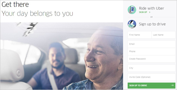
You can do this in a number of ways, but one of the most effective is also the simplest; just include more images of people, the way Uber does in the example below.
You could also combine this with social proof by offering pictures of the people who have given you reviews and testimonials.
(Image Source: Uber)
34. Your landing page has too much content.
Content is king, but that doesn’t mean you should overwhelm your users with it.
If your landing page content is too long, there’s no way your visitors will read it all—and even if they do, they’ll likely be too overwhelmed or distracted to take any further action.
Keep things concise.
35. Your landing page has too little content.
However, concise doesn’t mean light. Your landing page or blog post needs to be focused and brief, but shouldn’t be scarce.
People need information to be able to make a decision, so make sure you include enough details to reassure your visitors they’re making the right one.
Remember, you can always elaborate by building a backlink out to a separate page.
36. There’s no action-based language to direct user intent.
Your landing page should also feature strong, action-based language, with verbs that encourage visitor behaviors.
For example, callouts like “try it now” or “stop worrying about ____” are more effective than “available for purchase” or “the perfect solution.”
37. There’s no sense of urgency.
People make flash decisions on landing pages.
If they don’t make a decision within the first 10 seconds or so of visiting, they’re going to leave—and if they leave, they probably aren’t coming back to your landing page anytime soon.
Reverse your lacking performance by inducing a greater sense of urgency, which will reduce visitor hesitation and earn you more conversions overall.
You can do this by including more time-based language, showcasing limited time offers, or displaying the limited quantity still available.
Expedia is a master of this tactic, displaying small slide-ins that show users browsing hotels and airfare things like how popular this destination is, how full the hotel is, and how many more flight tickets are available for a given flight.
38. The price doesn’t seem good enough.
Note that this is a different dilemma than having an offer that’s not valuable enough. Here, your offer may be plenty valuable, but the price point doesn’t have as much initial appeal.
The best way to beat this is to change how you present your pricing; for example, you could take advantage of the psychological effect of discounts by showing your price as marked down from a previous high point.
39. You aren’t using buttons.
Everything outside your form should be reduced to button format.
Backlinks aren’t only ugly, they’re hard to click on mobile devices, so the more easily clickable buttons you can include in your design, the better – especially when you’re tapping your finger on a mobile device.
40. It’s clear your work came from a template.
Take a close look at your site as it compares to others. If it looks like it came from a template, it may look unprofessional.
That doesn’t mean you can’t use a template—it just means you have to be judicious when choosing one, opting for a platform that looks original, or at least stands apart from the usual options.
Similarly, try to avoid using stock photography when you can—it often comes off as cheap and impersonal. Invest in original images that have never been used before.
41. You haven’t called upon personal brands.
Personal brands are extremely powerful in the marketing world.
They’re personal (obviously), which makes them more relatable, and it’s possible to use them as a reinforcement of your brand’s reputation.
For example, you could use your CEO’s image and a quote from him/her to describe his/her vision for the company.
Something along the lines of “I built this company from the ground up so we could…” instantly adds some depth to your company’s history and may boost your visibility as well.
If implemented correctly, people will feel like they’re reaching out to a person, rather than some faceless corporation.
42. There isn’t enough flexibility.
It’s true that as a general rule, you should seek to limit the choices your users have; but this mostly applies to things like product options and service plan offerings.
Since you’ll be asking users for something valuable (money or personal information), you’ll need to give them some flexibility when it comes to options.
For example, while you’ll need to make some of your forms required, many of your forms should be listed as optional to fill out.
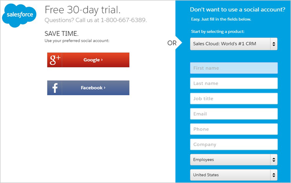
Similarly, it’s wise to accept a number of different payment options, so you don’t alienate anyone who feels more comfortable with one option over another. For example, SalesForce offers multiple ways to sign up for its free trial:
(Image Source: SalesForce)
43. There’s no social element.
There are many angles to take with integrating social media into your landing page, so if you aren’t using any of them, you’re missing out on some free extra landing page traffic and conversions.
For starters, you could embed some of your latest tweets and social media posts into your landing page as a secondary means of social proof.
You could also add quality links (including internal links) to your social media profiles as a peripheral “soft” conversion (earning new followers in the process).
You could even enable converters to share their experience on their social platform of choice to draw even more people to your landing page. All of these opportunities are free, easy, and can contribute to your landing page’s effectiveness.
44. Your landing page isn’t exciting.
If you want a high converting landing page, you need to generate a little bit of enthusiasm.
As we’ve seen, conversion is an emotional process as much as it is a logical one; merely presenting an item and describing why it’s worth what you’re requesting isn’t enough to persuade users.
You need to get them energized, so use exciting language and images to jazz them up.
Show them pictures of people having fun. Use strong, emotional words to make them sympathetically feel what you’re suggesting.
45. You don’t have any concrete evidence or numbers.
This isn’t an absolute necessity for your landing page, but it could be the factor that pushes them over the edge.
If your landing page doesn’t have any numbers, concrete evidence, or statistics to back up what you’re offering or what you’re selling, people may be less convinced that it’s worth their time or money.
Numbers are objective and inarguable, which makes them some of the most compelling types of evidence you can provide for your campaign.
Even a single metric, like your current number of customers, or other social proof, can be valuable here.
46. You haven’t marketed or advertised your landing page at all.
Remember, landing pages are designed to serve as a destination for visitors; if you don’t have a stream of visitors to direct, it’s not going to be able to perform that duty.
Even a well-designed landing page can’t attract visitors on its own in a vacuum, so you’ll need the help of marketing and advertising to get there.
As for the specific channels you use to generate traffic, think about your target audience and choose from there—content marketing, SEO, PPC ads, social media marketing, and other forms of advertising are all viable.
47. You’re advertising to the wrong audience.
Earlier in this guide, I listed a poorly targeted landing pge as a critical reason your landing page might not be working—but the targeting problem may begin even sooner, if you’re targeting the wrong audience in your marketing and advertising.
Think of your advertising campaign as a filter for your incoming audience; this is your chance to choose exactly who should be coming to your landing page.
Getting the right audience there is half the battle, so be sure you’re using whatever demographic targeting features you can, and refine your messaging.
48. Your lead-in doesn’t match your landing page.
Sometimes, marketers like to promise more than they can deliver in order to get people in the door.
For example, you may claim that you’re offering “rock-bottom” prices for your products—but if a user arrives on your page and sees that these prices are barely competitive, let alone “rock bottom,” they may leave immediately.
Truth in advertising goes a long way here; if you make a claim with your lead-in, make sure you’re able to back it up with the content that’s actually on your landing page.
49. You haven’t diversified your traffic generation efforts.
There’s more than one way to attract traffic to your landing page. How many have you tried?
Even with audience targeting options in place, different traffic channels may offer different advantages for your brand; for example, social media users may be more energetic, and organic search visitors may be further along in the sales funnel.
Even if you don’t stick with them forever, you should at least try a number of different traffic generation methods to maximize your potential.
50. You haven’t experimented with anything.
The secret to effectiveness in conversions and landing pages—and I’d argue marketing in general—is experimentation.
There’s no universally reliable way to predict exactly how your audience will react to something until you actually make the change.
And if you don’t change things, you’ll never know if it can be better. Your entire landing page strategy should be a constantly shifting experiment; change colors, change fonts, change layouts, change offers, and keep changing things, one at a time, until you piece together a product that earns the conversions you need.
Unbounce and Leadpages are two highly respected and recommended A/B testing platforms for complete landing pages. Both allow you to create mobile-optimized pages from templates or scratch, and A/B test any element you can think of.
Conclusion
Now that you’ve reached the end of this guide, you should have been able to pinpoint at least a handful of plausible reasons why your landing page isn’t more effective than it is. Once you put some corrections in place, you’ll be able to optimize your conversion rates and earn a higher overall return, but don’t be fooled in thinking that this new threshold is the ultimate goal; the truth is, your strategy can always be better, so continue striving for better and better results.
Tim holds expertise in building and scaling sales operations, helping companies increase revenue efficiency and drive growth from websites and sales teams.
When he's not working, Tim enjoys playing a few rounds of disc golf, running, and spending time with his wife and family on the beach...preferably in Hawaii.
Over the years he's written for publications like Forbes, Entrepreneur, Marketing Land, Search Engine Journal, ReadWrite and other highly respected online publications. Connect with Tim on Linkedin & Twitter.
- How to Rank for Local SEO in Multiple Locations - April 16, 2024
- SEO for Mass Tort Lawyers: Everything You Need to Know - April 3, 2024
- Natural Backlinks vs. Unnatural Backlinks: How to Build a Natural Link Profile - April 1, 2024

